Shading skintones (paging Kitty)
Moderator: Forum Moderators
Forum rules
Before posting critique in this forum, you must read the following thread:
Before posting critique in this forum, you must read the following thread:
-
Sgt. Groovy

- Art Contributor
- Posts: 1471
- Joined: May 22nd, 2006, 9:15 pm
- Location: Helsinki
Shading skintones (paging Kitty)
On this thread, Kitty said:
In hue-based colour terms (whether HSL or HSV) adding black does not change the hue of the colour, only the lightness or value (in HSL, adding black or white changes lightness, in HSV adding black decreases value, whereas adding white decreases saturation and increases value).
The difference between light and shadow (of the same object colour) is that the shadow areas receive (and thus reflect) less light, but they also get their light from a different light source. More striclty speaking, the lighted areas get their light both directly from the light source and from the ambient light reflected from elsewhere in the scene, but the shadow areas only get the ambient light. The spectrum (hue) of the ambient light is usually at least a bit different than the spectrum of the direct light, so the hue of the shadow areas is usually different than the lit areas. This applies to all colours, not just skintones. In a sunlit scene the lit areas get light mostly from the sun, which is fairly white, but the shadow areas are lit by the sky, which is blue. You see this best in snowy scenes, where the shadows are clearly blue. That is, in a sunlit picture, make shadows by mixing not with black but with blue with very low lightness/value.
What should be noted with skintones is that the diffuse reflections reflect from little below the surface of the skin, but the specular reflections reflect from the surface. The blood and the pigments, that give the skin its colour, are located inside the skin so they only affect the diffuse reflections. This is more important with darker skin, where the pigment is stronger and therefore affects the diffuse reflection more, whereas the specular reflection is pretty much the same in dark and light skin.
I would be nice if Kitty could, in her own colour paradigm, explain with what the skintones should be shaded with, if not with black and grey.
I'd like to extend that a bit. "Shading with black" follows the real-life paint-mixing paradigm that I personally don't use much in digital art myself. I always think colours as numbers, as points in the colour space, and mostly I think in HSL-space, and use RGB for specific situations.don't shade skin with black/grey! never!
In hue-based colour terms (whether HSL or HSV) adding black does not change the hue of the colour, only the lightness or value (in HSL, adding black or white changes lightness, in HSV adding black decreases value, whereas adding white decreases saturation and increases value).
The difference between light and shadow (of the same object colour) is that the shadow areas receive (and thus reflect) less light, but they also get their light from a different light source. More striclty speaking, the lighted areas get their light both directly from the light source and from the ambient light reflected from elsewhere in the scene, but the shadow areas only get the ambient light. The spectrum (hue) of the ambient light is usually at least a bit different than the spectrum of the direct light, so the hue of the shadow areas is usually different than the lit areas. This applies to all colours, not just skintones. In a sunlit scene the lit areas get light mostly from the sun, which is fairly white, but the shadow areas are lit by the sky, which is blue. You see this best in snowy scenes, where the shadows are clearly blue. That is, in a sunlit picture, make shadows by mixing not with black but with blue with very low lightness/value.
What should be noted with skintones is that the diffuse reflections reflect from little below the surface of the skin, but the specular reflections reflect from the surface. The blood and the pigments, that give the skin its colour, are located inside the skin so they only affect the diffuse reflections. This is more important with darker skin, where the pigment is stronger and therefore affects the diffuse reflection more, whereas the specular reflection is pretty much the same in dark and light skin.
I would be nice if Kitty could, in her own colour paradigm, explain with what the skintones should be shaded with, if not with black and grey.
Tiedäthän kuinka pelataan.
Tiedäthän, vihtahousua vastaan.
Tiedäthän, solmu kravatin, se kantaa niin synnit
kuin syntien tekijätkin.
Tiedäthän, vihtahousua vastaan.
Tiedäthän, solmu kravatin, se kantaa niin synnit
kuin syntien tekijätkin.

Re: Shading skintones (paging Kitty)
(I shouldn't have posted anything, sorry.)
Last edited by doofus-01 on September 5th, 2008, 12:15 am, edited 1 time in total.

Re: Shading skintones (paging Kitty)
you've got some interesting thoughts here, groovy!
this is only a preliminary answer until i have time to write something in more depth.
first, i would try to keep it easy. for our purposes in wesnoth we don't need a full colour theory. it's merely about colourizing lineart, which is a world less demanding and chalenging than "real" painting or illustrating.
second, i would keep colour theory and flesh tones distinct. of course both are concerned with each other. a basic understanding of colour theory has to come first obviously. skin is only one special case.
my colour theory isn't as consistent as yours. i'm still rooted in physical pigments and colour mixing. my digital understanding is mainly based on the photoshop colour picker - chroma, hue and saturation. a short colour theory tutorial i found very insightful is here.
a basic rule for shading everything (i don't know were i picked it up, but it proved right and helpful more than once) is to have the highlights fairly desaturated, semi-saturated mid tones and highly saturated dark tones. (i don't know how but this has something to do with the way we see - if you stare long enough into the shadows you'll start to see more and more colours and hues, but if you stare at the highlights they get even more uniform.)
but now on to the flesh:
there are maaany things to take into consideration (and this is much more complex than colourizing a portrait is worth imho)
- light (what temperature, colour and saturation is the light?)
- shadows (often opposite temperature as that of the light. or shift toward the compliment colour of the light. and other surrounding surfaces can change this by bouncing colour into the shadows and shifting it toward the colour which it is reflecting)
- light affects the local colour: difference between places were the skin is thin (e.g. nose) and the light can shine through and were it is thick and more reflective.
but the rest is obversation: study from life, look into the mirror and look at your own skin. set up different lightings. and then try to pick the right colours (no matter if you mix real acrylics or use the digital colour picker), not the ones you expect to see, not the local colour but the ones you really see. it's harder than you think...
(this is not only a practise for skin tones but a basic one for every kind of painting - at the moment i do serveral little still lives i set up next to my comp every week (example and another example). and it helps my understanding of colour greatly)
phew - this got longer than i intended...
-
Sgt. Groovy
- Art Contributor
- Posts: 1471
- Joined: May 22nd, 2006, 9:15 pm
- Location: Helsinki
Re: Shading skintones (paging Kitty)
First few words about the concept of "saturation" for those who are not well versed in the different colour spaces. Saturation is one of the axes of the hue-based color spaces, HSV and HSL , but it it differs slightly in them. This difference is best explained with the following image (HSL is on the left and HSV on right):
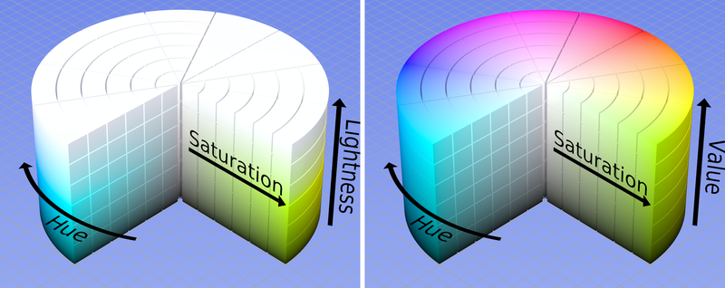
As you see, in HSV the saturation of colours very close to white are in low saturation, but not necessarily in HSL. For the remainder of this thread we will stick to the HSV concept of saturation, because HSV is used in both Photoshop and GIMP.
Then there is also the spatiality to consider. When we do a 2-d image of a 3-d scene, it's not only the sense of lighting we have to create, but sense of depth as well. Colour will factor into this because more saturated colours tend to look closer than less saturated ones.
But assuming saturation follows the toning, as in your rule-of-thumb, the central question is, where do you start shading? Usually an intuitive approach is to start from the midtones, and then add shadows and highlights, but working within the paint-mixing paradigm, wouldn't it be most sensible to first find the most saturated shade (the fullest, the "real" shade of it) and then desaturate it by tinting with other colours? That way you would start from the shadows. This could also be made intuitive if you think it as adding different aspects of the lighting in layers. You start from complete darkness, then add the ambient light that falls everywhere. Then you add the direct light(s) that only illuminates part (the highlights) of the scene.
The saturation's relation to light and shadow is one issue where the artist must think about how the eye sees the colours. In a real setting the eye adjusts to the overall lighting level, and this affects the perceived colours. In a very brightly lit environment, the highlights overexpose the retina, and therefore they look washed out, almost white, and only in shadows one can see proper colours. In a lower light level, the optimal light level (in relation to what the eyes are adjusted to) might be the highlights, and the shadows would look murky. The artist can use the saturation range to influence how the lighting looks to the viewe, wheter it looks soft or hard, how intense is the direct ligth in relation to the ambient one, etc.
The eye also always sees things in context. Consider the Kittys image of elvish archer below:

Notice how Kitty has made the string darker where it is seen against the lighter background of the arm. This is how the eye would see this, though not how a camera would pick it. There are contrast-enhancing and shape-recognition mechanisms in our visual sensory system, and the image processing actually already starts at the retina, where the individual photoreceptor cells have neural connections to their neighbours, through which they inhibit and excite each other to increase contrast. Kitty's trick simulates exactly these mechanisms and that's why it makes the image easier for our mind to translate.
But the important thing is that most of the time, shadows and highlights receive light of different colours, and this must be reflected on the colours of the shadowed and highlighted parts. That is, not only the saturation and llightness, but also the hue must change between shadow and light.
Though I must ask, if you're using the colour wheel and want to "shift toward the compliment colour," do you shift clockwise or counterclockwise?
As you see, in HSV the saturation of colours very close to white are in low saturation, but not necessarily in HSL. For the remainder of this thread we will stick to the HSV concept of saturation, because HSV is used in both Photoshop and GIMP.
I agree in general, but I also think there are more things, and special cases, to consider. One is the actual colour of the light that illuminates the shadows vs. the colour of the direct light, and their relation to the object colour. Like I said earlier, in outdoor lighting the shadows receive bluer light than the highlights. For objects in the blue-green range, this means that the shadows will indeed look more saturated, but for red-yellow objects it will be the opposite, because the blue skylight will desaturate them, and only the white sunlight will bring out their full colours.a basic rule for shading everything (i don't know were i picked it up, but it proved right and helpful more than once) is to have the highlights fairly desaturated, semi-saturated mid tones and highly saturated dark tones.
Then there is also the spatiality to consider. When we do a 2-d image of a 3-d scene, it's not only the sense of lighting we have to create, but sense of depth as well. Colour will factor into this because more saturated colours tend to look closer than less saturated ones.
But assuming saturation follows the toning, as in your rule-of-thumb, the central question is, where do you start shading? Usually an intuitive approach is to start from the midtones, and then add shadows and highlights, but working within the paint-mixing paradigm, wouldn't it be most sensible to first find the most saturated shade (the fullest, the "real" shade of it) and then desaturate it by tinting with other colours? That way you would start from the shadows. This could also be made intuitive if you think it as adding different aspects of the lighting in layers. You start from complete darkness, then add the ambient light that falls everywhere. Then you add the direct light(s) that only illuminates part (the highlights) of the scene.
Most likely it has something to do with plenty of things but definitely by the way we see. No matter what the medium, the light sent to our eyes by a 2-d image is always totally different fromthe light coming from a real 3-d scene. For that reason, to fool the viewer to see a real scene instead of blots of colours on a flat surface, we must simulate on the canvas lot of neural and cognitive processes that take place in the eyes, brain and mind when looking at actual scenes.i don't know how but this has something to do with the way we see - if you stare long enough into the shadows you'll start to see more and more colours and hues, but if you stare at the highlights they get even more uniform.
The saturation's relation to light and shadow is one issue where the artist must think about how the eye sees the colours. In a real setting the eye adjusts to the overall lighting level, and this affects the perceived colours. In a very brightly lit environment, the highlights overexpose the retina, and therefore they look washed out, almost white, and only in shadows one can see proper colours. In a lower light level, the optimal light level (in relation to what the eyes are adjusted to) might be the highlights, and the shadows would look murky. The artist can use the saturation range to influence how the lighting looks to the viewe, wheter it looks soft or hard, how intense is the direct ligth in relation to the ambient one, etc.
The eye also always sees things in context. Consider the Kittys image of elvish archer below:
Notice how Kitty has made the string darker where it is seen against the lighter background of the arm. This is how the eye would see this, though not how a camera would pick it. There are contrast-enhancing and shape-recognition mechanisms in our visual sensory system, and the image processing actually already starts at the retina, where the individual photoreceptor cells have neural connections to their neighbours, through which they inhibit and excite each other to increase contrast. Kitty's trick simulates exactly these mechanisms and that's why it makes the image easier for our mind to translate.
A this point I must remind everyone that there are two different concepts of "temperature" for colour. One is the colour teperature of light, which refers to the closest temperature of a blackbody radiation, and this is absolute, physically determined quantity. The other is how "warm" or "cold" a colour looks, and this is relative and to some extent subjective quantity. These are different things, and in many cases opposite, as blue is thought to be "colder" colour than red, even though its colour temperature is higher. Also, the concept of "warm" and "cold" shades can be used with greens and purples, even though green and violet don't really have a colour temperatures (blackbodies never radiate green or purple light).light (what temperature, colour and saturation is the light?)
Using colder colours for shadows and warmer for highlights (or vice versa) is a useful rule-of-thumb, as it maximizes the chromatic contrast and makes the image more dynamic and life-like. Even here, though, there are more things to consider, such as the actual colors of the lights. That is, if you have a scene with blue ambient light, and a red spotlight, you must make the shadows blue and the highlights red, even though they are not the opposites.shadows (often opposite temperature as that of the light. or shift toward the compliment colour of the light. and other surrounding surfaces can change this by bouncing colour into the shadows and shifting it toward the colour which it is reflecting)
But the important thing is that most of the time, shadows and highlights receive light of different colours, and this must be reflected on the colours of the shadowed and highlighted parts. That is, not only the saturation and llightness, but also the hue must change between shadow and light.
Though I must ask, if you're using the colour wheel and want to "shift toward the compliment colour," do you shift clockwise or counterclockwise?
Very important, but one thing you forgot is that skin is actually different colour in different places of body, and can even be different colour in the same place in different conditions.light affects the local colour: difference between places were the skin is thin (e.g. nose) and the light can shine through and were it is thick and more reflective.
The most important advice, but there are problems too. I have an idea for a comic where the protagonist is black, but I have noticed that the rules I have learned for skin shading don't work as well for dark skin. It's not enough to just adjust everything to darker shades, there is more to the difference. But the problem is, I live in Finland, most people are white, all the models in the life drawing classes are white and there is even a white dude in the mirror! I'm pretty sure that the black people who do live here wouldn't much appreciate me following them around to study them.but the rest is obversation: study from life, look into the mirror and look at your own skin.
Tiedäthän kuinka pelataan.
Tiedäthän, vihtahousua vastaan.
Tiedäthän, solmu kravatin, se kantaa niin synnit
kuin syntien tekijätkin.
Tiedäthän, vihtahousua vastaan.
Tiedäthän, solmu kravatin, se kantaa niin synnit
kuin syntien tekijätkin.
-
Sgt. Groovy
- Art Contributor
- Posts: 1471
- Joined: May 22nd, 2006, 9:15 pm
- Location: Helsinki
Re: Shading skintones (paging Kitty)
There is more to say about shading and context. All human perception is highly contextualised, and color perception is even ridiculously so. An artist should always remember that colour is not a property of light, neither it is a property of physical objects, but it is a subjective experience of the mind. To make that point clear, please observe the image below:

The squares in the centre of the facets are all the same absolute colour, that is, they have the same RGB values. Yet in the upper image, because of the context, the lower and upper squares appear to be of very different colour.
Skintones are also context-dependent. The same absolute tones can have different arrearance in different environments. For example, very colourful clothes tone down the skin colour and may even make it look pale and sickly, while flatly coloured clothing bring out the skin. Consider the (rather cheeky) example below. The skin parts are exactly the same in both images, only the surroundings have changed. Even though the effect is not quite as striking as in the previous example, the skin in the left image stands out more, even almost detaches itself from its environment, whereas the skin in the right image blends more in with the surroundings. There are no "correct" skintones, or sets of RGB values that denote what skin "really" looks like, and the "skintone palettes" you can find on the web are only good as starting points, you will always have to adjust them to fit the context.
- Attachments
-
Tiedäthän kuinka pelataan.
Tiedäthän, vihtahousua vastaan.
Tiedäthän, solmu kravatin, se kantaa niin synnit
kuin syntien tekijätkin.
Tiedäthän, vihtahousua vastaan.
Tiedäthän, solmu kravatin, se kantaa niin synnit
kuin syntien tekijätkin.
Re: Shading skintones (paging Kitty)
whoah - that's what i call a lenghty post! again you make a lot of interesting (and right) points.
i'm not entirely happy with the way you cite me, but i won't go into details for now since i fear this thread would get unreadable... and you may assume for everything i write that there are exceptions - you don't need to mention this specificly. and i don't think that my elves are particularly good examples for skin colour: their skin is way too saturated, has no hue variation at all and uses white highlights - all big no-nos for painting human skin. i decided to paint them this way to make them more non-human and glowing.
-----
for your problem with dark skin i would suggest to use a resource you don't like - photos. of course they may be edited but you'll get an idea. studying other artists work will also prove helpfull. sometimes the obvious is the best (things i remember are generally less highlights and try out some cool highlights)
-----
and i would like to renew my proposal from my last post - please keep the colour theory and skin painting topics apart. those are two intertwined questions but it gets extremly confusing the way you present it. i would like to assume for this discussion about skintones (like the title of this thread suggests) that basic colour theory and terminology is known (or can be wikied).
-----
i find your point about "where to start shading" very interesting. i'm also one of those midtone gals - it's just intuitive. the midtone is which determines the impression of the picture. you have generally "more" midtone than highlights and shadows. it's like calling the midtone your base and from there developing the extremes. to me it feels wrong to start at the extrem to find the middle.
your traitional paint mixing analogy doesn't work very well imho - true, you have the pure colours first, but when you mix them you create sort of a gradient from which you can pick every shade at every time. thus it doesn't matter which way around you use this gradient.
another approach commonly used in digital painting is the grisaille method. doing the whole thing with only b and w values first and then "glazing" over it with colour. that way you have very much control over the overall value and you only have to worry about one thing at a time - first only value and then only hue/saturation (since you have already got the values).
-----
i followed my own advise today and had a look at some other artists' work. mostly contemporary realistic painters and caucasian's portraits. (see attatchment)
i put them on a 50% grey background and colourpicked the skin colours from lightest to darkest. that way we only have to worry about hue and saturation and not value by analyzing them.
as you can see there are some where the hue is overall the same (III and VI). more often the hue changes throughout the values. sometimes nearly linear from one to an other, like in (I and IV) red to yellow. sometimes from one colour to another and back again (V) and in some cases through a couple of different hues, e.g. (II) from orange (in the lights and midtones) over pink and purple to red (in the shadows).
you can see that all those portraits need no pure white and black (like real skin has no white and black) - each highlight will always have color in it. (that's what my original comment in doofus' thread was about)
the second issue is the saturation throughout the values. most cases follow our little rule of thumb - the saturation increases nearly linear from the light to the dark shades. the shadows are brightly coloured while the highlights are pretty desaturated - but strangely and luckily it doesn't appear to be that way... (XII) and (XVII) are interesting exceptions - here we have the standard saturation progression until the final darkest shade which is again fairly desaturated.
my impression is (and you may disagree) that the most important thing is the value. while the skin colour's hue and saturation vary greatly from one person to another, from one part of the body to another, from light situation to light situation and from the surroundings, the value stays and is most recognizable. if you manage to describe the form well which is determined and described by the value you have nearly won.
those are by no means rules, just observations one can take into account when painting skin the next time...
a whole new topic would be skin's micro texture and its colours. there are exciting colours to be studied, some impressionist and pointilist works on this are worth looking into. unfortunately i have nearly zero experience in this area and thus will leave this raw for now.
another artist coming to my mind who's digital painting of skin is more than remarkable (in colour and texture) is linda bergvist!
you often write that the artist has to think about the way the eye sees something. i think that is were our concepts differ most - i believe one has not necessarily to think about the way the eye sees because one just sees. what you have to learn is not knowledge but to see truly.
i'm not entirely happy with the way you cite me, but i won't go into details for now since i fear this thread would get unreadable... and you may assume for everything i write that there are exceptions - you don't need to mention this specificly. and i don't think that my elves are particularly good examples for skin colour: their skin is way too saturated, has no hue variation at all and uses white highlights - all big no-nos for painting human skin. i decided to paint them this way to make them more non-human and glowing.
-----
for your problem with dark skin i would suggest to use a resource you don't like - photos. of course they may be edited but you'll get an idea. studying other artists work will also prove helpfull. sometimes the obvious is the best
-----
and i would like to renew my proposal from my last post - please keep the colour theory and skin painting topics apart. those are two intertwined questions but it gets extremly confusing the way you present it. i would like to assume for this discussion about skintones (like the title of this thread suggests) that basic colour theory and terminology is known (or can be wikied).
-----
i find your point about "where to start shading" very interesting. i'm also one of those midtone gals - it's just intuitive. the midtone is which determines the impression of the picture. you have generally "more" midtone than highlights and shadows. it's like calling the midtone your base and from there developing the extremes. to me it feels wrong to start at the extrem to find the middle.
your traitional paint mixing analogy doesn't work very well imho - true, you have the pure colours first, but when you mix them you create sort of a gradient from which you can pick every shade at every time. thus it doesn't matter which way around you use this gradient.
another approach commonly used in digital painting is the grisaille method. doing the whole thing with only b and w values first and then "glazing" over it with colour. that way you have very much control over the overall value and you only have to worry about one thing at a time - first only value and then only hue/saturation (since you have already got the values).
-----
i followed my own advise today and had a look at some other artists' work. mostly contemporary realistic painters and caucasian's portraits. (see attatchment)
i put them on a 50% grey background and colourpicked the skin colours from lightest to darkest. that way we only have to worry about hue and saturation and not value by analyzing them.
as you can see there are some where the hue is overall the same (III and VI). more often the hue changes throughout the values. sometimes nearly linear from one to an other, like in (I and IV) red to yellow. sometimes from one colour to another and back again (V) and in some cases through a couple of different hues, e.g. (II) from orange (in the lights and midtones) over pink and purple to red (in the shadows).
you can see that all those portraits need no pure white and black (like real skin has no white and black) - each highlight will always have color in it. (that's what my original comment in doofus' thread was about)
the second issue is the saturation throughout the values. most cases follow our little rule of thumb - the saturation increases nearly linear from the light to the dark shades. the shadows are brightly coloured while the highlights are pretty desaturated - but strangely and luckily it doesn't appear to be that way... (XII) and (XVII) are interesting exceptions - here we have the standard saturation progression until the final darkest shade which is again fairly desaturated.
my impression is (and you may disagree) that the most important thing is the value. while the skin colour's hue and saturation vary greatly from one person to another, from one part of the body to another, from light situation to light situation and from the surroundings, the value stays and is most recognizable. if you manage to describe the form well which is determined and described by the value you have nearly won.
those are by no means rules, just observations one can take into account when painting skin the next time...
a whole new topic would be skin's micro texture and its colours. there are exciting colours to be studied, some impressionist and pointilist works on this are worth looking into. unfortunately i have nearly zero experience in this area and thus will leave this raw for now.
another artist coming to my mind who's digital painting of skin is more than remarkable (in colour and texture) is linda bergvist!
you often write that the artist has to think about the way the eye sees something. i think that is were our concepts differ most - i believe one has not necessarily to think about the way the eye sees because one just sees. what you have to learn is not knowledge but to see truly.
- Attachments
-
-
Sgt. Groovy
- Art Contributor
- Posts: 1471
- Joined: May 22nd, 2006, 9:15 pm
- Location: Helsinki
Re: Shading skintones (paging Kitty)
I have more to say, but let me just share a revelation I just had about the "shadows are more saturated" rule. I made similar experiments as kitty, on photographs and found the rule to hold in most cases. Because the thing applies to photos as well, it must be a real phenomenon, not just a quirk of the perceptive cognition that a skillfull artists must simulate. But there is the apparent contradiction: If it's the light that brings out colour, how can there be more colour where there is less light?
The key to the enigma lies in the concept of "colour saturation." Saturation doesn't really mean more, but purer colour. The narrower the light's spectrum, the more saturated the colour, and full saturation is reached when the spectrum is monochromatic, that is, essentially zero-width.
Another component of the answer is how photoreceptive systems adjust to different lighting levels. What is common to both the retina and film/CCD is that light with an intensity of less than certain treshold doesn't excite the photoreceptors but registers as black, and higher the light level the system has adjusted to, higher also the excitement treshold.
Now imagine an object with the same surface colour everywhere, set in an illumination where both the highlights and shadows are illuminated with white light, shadows receiving 50% less light. The spectrum of the light reflected toward the viewer is exactly the same from both areas, except the intensity is twice as high for the highlights in all points of the spectrum. It is possible that the intensity of some of the wavelengths of the light from the shadows are below the excitement treshold while they are above it for the highlight light. In this case, the eye sees less wavelengths from the shadows, on other words the shadow light seems to have narrower spectrum and thus causes more saturated colour experience.
The phenomenom is illustrated in the image below. There are two spectrums, similar in shape, the right one being twice as high. The "colour of light" is the same for both spectrums, but the intensity is higher for the right one. The red line is the excitement treshold, and we can see that parts of the left spectrum are below it. The green parts show the parts of each spectrum that are above the treshold, that is, registered by the eye. The perceived spectrums are thus different, the right one seeming less saturated because it contains more wavelengths. The same pehenomenon also accounts for colours seeming more saturated in higher general light levels (even in lighting levels where only cones are used). In higher level of illumination the excitement treshold is higher, and thus more "lesser components" of any spectrum are cut off, making the perceived colours more saturated.
- Attachments
-
Tiedäthän kuinka pelataan.
Tiedäthän, vihtahousua vastaan.
Tiedäthän, solmu kravatin, se kantaa niin synnit
kuin syntien tekijätkin.
Tiedäthän, vihtahousua vastaan.
Tiedäthän, solmu kravatin, se kantaa niin synnit
kuin syntien tekijätkin.

Re: Shading skintones (paging Kitty)
By the way - thank *both* of you for these posts - they've been very informative. Especially that one link to that Linda Bergvist's website - her technique for textured brushes is awesome, and I'd never known how to do that before.
That's a very accurate impression - in fact that's demonstrable scientific fact. The brightness/luminosity* (sometimes called "value") differences inside an image are far more significant than the color changes. And it's really easy to demonstrate - here are two versions of that same picture you posted, the one on the left has the brightness differences removed, the one on the right has the color differences removed.
Wow:
* Personally, I don't like calling it value, because value's unintuitive - it's as vague as "amount" or "number", and you can't intuitively figure out what it is just by looking at the word - is it brightness value, hue value, saturation value (or several other possibilities)? It confuses beginners (including me, not too long ago), and there are better words that aren't confusing at all. I know there are established conventions - but thankfully, digital imaging is establishing new, better conventions, because coders hate being ambiguous. They're common enough that many people know them, now, and I hope those become dominant, because they're intrinsically easier to understand.
Yeah, I'm a dork for this little idiosyncracy, but hopefully it's for the greater good.
kitty wrote:my impression is (and you may disagree) that the most important thing is the value. while the skin colour's hue and saturation vary greatly from one person to another, from one part of the body to another, from light situation to light situation and from the surroundings, the value stays and is most recognizable. if you manage to describe the form well which is determined and described by the value you have nearly won.
Wow:
Yeah, I'm a dork for this little idiosyncracy, but hopefully it's for the greater good.
Play Frogatto & Friends - a finished, open-source adventure game!
Re: Shading skintones (paging Kitty)
As further proof of what was said above, consider that black & white photography would be a waste of time if "value" were not so important.
(I thought I saw "value" referred to as "volume" somewhere, but can't seem to find it now. Maybe I just dreamed it.)
(I thought I saw "value" referred to as "volume" somewhere, but can't seem to find it now. Maybe I just dreamed it.)