Because I rock I deserve my own topic.
Moderator: Forum Moderators
-
Neoriceisgood
- Art Developer
- Posts: 2221
- Joined: April 2nd, 2004, 10:19 pm
- Contact:
Because I rock I deserve my own topic.
Should I do this?
- Attachments
-
- drakechange.png (11.11 KiB) Viewed 14736 times
-
- drakeburner-idle-1.png (4.3 KiB) Viewed 14745 times
Signature dropped due to use of img tag

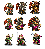
If we compare this to the version seen in this previous attempt, I think this new one is a huge improvement. There are a few things that bug me about the new one, such as the breastplate being oddly centered, and the small wings, but it's pretty good.
I'll take a shot at an edit, if you don't mind.
Regarding the following; I really like the hand-claws on the higher-level units, and I also really liked the mane that the L3 developed; I thought it was really original, and also looked very cool. I also like the face on the L3.
I'll take a shot at an edit, if you don't mind.
Regarding the following; I really like the hand-claws on the higher-level units, and I also really liked the mane that the L3 developed; I thought it was really original, and also looked very cool. I also like the face on the L3.
-
Neoriceisgood
- Art Developer
- Posts: 2221
- Joined: April 2nd, 2004, 10:19 pm
- Contact:
Some thoughts, expressed in the "picture is worth a thousand words" style:
- an attempt at fix to the breastplate - I haven't seen what your fix was going to be, so that one might be better.
- I think that all of the drakes should have quite bigger wings. One thing to keep in mind is that we have no hex restrictions for everything but the base frame; so if these get huge when they unfurl... great!
- Attachments
-
- drakeburner.png (2.13 KiB) Viewed 14638 times
Also, I've been thinking for some time that we should try and see if we can come up with a way for the wings to not be red; partly because such a bold primary red looks a lot like the red team color, and partly because I think different colors might complement their skin tones better.
Here are a few attempts; tell me what you think:
(Note, I've been intelligent about this, and have shifted the palette, rather than just the pixels on the wings; so the other places on the drake where these colors occur also got changed.)
Here are a few attempts; tell me what you think:
(Note, I've been intelligent about this, and have shifted the palette, rather than just the pixels on the wings; so the other places on the drake where these colors occur also got changed.)
- Attachments
-
- drake-wing-colors.png (3.2 KiB) Viewed 14633 times
-
Neoriceisgood
- Art Developer
- Posts: 2221
- Joined: April 2nd, 2004, 10:19 pm
- Contact:
Okay, here's a fixed up version of the burner;
changes are small but;
1- fixed shading on the back arm
2-fixed AA on mouth
3-fixed foremost horn
4- made wings larger
5-fixed chest
6-some more minor details.
hope you like;
- As for the wings, I chose red wings with green skin because that's kind of the "classic" dragon look; perhaps we should see how the burner looks in all Tcolour types to see how much the red wings hurt it?
- Attachments
-
- drakeburner-idle-1.png (4.41 KiB) Viewed 14628 times
Signature dropped due to use of img tag
-
Neoriceisgood
- Art Developer
- Posts: 2221
- Joined: April 2nd, 2004, 10:19 pm
- Contact:
Here's a thought, which fortunately your redesign does not preclude (e.g. it should be fairly easy to try this):Neoriceisgood wrote:DOUBLE POST;
Also made a quick revamp for the Fighter.
One potential idea for the fighter line would be to give him claw-gauntlets - elongated metal things, not terribly unlike what wolverine has, but which are strapped to his wrist. I think that flying with those would be considerably easier because of balance, and that the drakes would have better use of them because of their similarity-in-usage to the drake's natural claws.
Plus this would mean no changes to the stats. (The bummer of this redesign is that we can't change the unit tree at all; however, we don't have any pressing need to do so).
I think this would add a lot to the flavor of the drakes, for them to not use typically "human" weapons, but to use something a bit more adapted to their bodies' design. Just a thought, though - you can make the decision on this.
-
wayfarer

- Art Contributor
- Posts: 933
- Joined: June 16th, 2005, 7:07 pm
- Location: Following the Steps of Goethe
- Contact:
I like the the more dynamic pose on the other side I agree with freim I prefered the dark colors more and the breast plate let them look slightly female.
The idea with the mane I don't know if the idea is that hot. Don't get me wrong I haven't got anything against the drakes but reptiles barely have any kind of hair.
The idea with the mane I don't know if the idea is that hot. Don't get me wrong I haven't got anything against the drakes but reptiles barely have any kind of hair.
This girl, this boy, They were part of the land. What happens to the places we used to tend?
She's a hard one to trust, And he's a roving ghost. Will you come back, will you come back, Or leave me alone?
-Ghost Fields
She's a hard one to trust, And he's a roving ghost. Will you come back, will you come back, Or leave me alone?
-Ghost Fields

Well, all the real dragons I have seen so far had a mane..wayfarer wrote: The idea with the mane I don't know if the idea is that hot. Don't get me wrong I haven't got anything against the drakes but reptiles barely have any kind of hair.
-
Neoriceisgood
- Art Developer
- Posts: 2221
- Joined: April 2nd, 2004, 10:19 pm
- Contact:
freim wrote:Technically better drawn than the old ones, but I'm afraid I can't get myself to like the overall style. They are way to "cartoony" and wimpy imo, especially with the much brighter coloration of the skin.
btw, are they all supposed to be female since they all seem to have breasts?
when you say "cartoony" do you just refer to the palette? because palette and the armor aside, I don't really see what makes the new ones that much more "cartoony" than the old ones.
And the "breasts" thing is mostly the result of shading the chestplates the same way as before, but with brighter colours; I'll get around to fix that if it's bothersome. (unless someone wants drakes to have genders?
As for them looking "Wimpy" (based on uhh..colour?)
I don't think there's anything wrong with level 1 drakes not looking like the toughest m/f around as it allows me to make the level 2 & 3 drakes look tougher in more ways than just size and armor.
That aside, sorry to hear you don't like them, I was really happy with the result
Signature dropped due to use of img tag
-
Kestenvarn

- Inactive Developer
- Posts: 1307
- Joined: August 19th, 2005, 7:30 pm
- Contact:
- Breastplate should be fine without the highlight.
- Gold trim at the bottom of the tabard looks better than the white trim of the breastplate... the white is very shiny and fake, like cosplay or something.
- Skin tone seems really bright so it's difficult to pick out details on the forum background. Maybe needs more contrast... were you dead set on the pale green/yellow?
That second line is pretty impressive, especially the last unit! Got a bit of the same contrast problem there too, though.Jetryl wrote:
Hmm, maybe my monitor is set strangely. Do these images look very bright to anyone else?
-
wayfarer
- Art Contributor
- Posts: 933
- Joined: June 16th, 2005, 7:07 pm
- Location: Following the Steps of Goethe
- Contact:
No actual not they use almost the same color palette + some brighter highlights.
Against my monitor at least.
The breast plate is indeed the biggest drawback the sexual ambiguity is distracting.
The brighter colors are just personal preference I like them more darker (too much Fakemon eh?).
@allefant
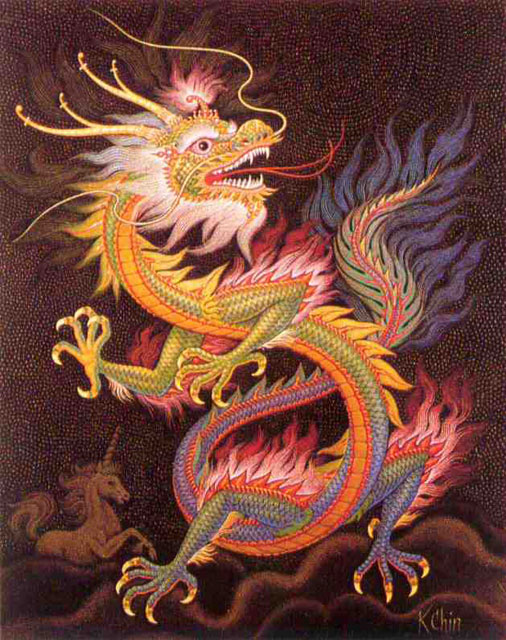
I like to compare dragons to the old medieval european dragons who were just big reptiles with wings and to draco .
.
Which I thought was quite felicitous.
I don't like all the Far Eastern myths I prefer mostly the european ones they have more guts.
Against my monitor at least.
The breast plate is indeed the biggest drawback the sexual ambiguity is distracting.
The brighter colors are just personal preference I like them more darker (too much Fakemon eh?).
@allefant
I like to compare dragons to the old medieval european dragons who were just big reptiles with wings and to draco
Which I thought was quite felicitous.
I don't like all the Far Eastern myths I prefer mostly the european ones they have more guts.
This girl, this boy, They were part of the land. What happens to the places we used to tend?
She's a hard one to trust, And he's a roving ghost. Will you come back, will you come back, Or leave me alone?
-Ghost Fields
She's a hard one to trust, And he's a roving ghost. Will you come back, will you come back, Or leave me alone?
-Ghost Fields

And what's wrong if they are all female sprites? We have all-male represented factions too. I agree with you though; it's a bit tooo round if you want them to look male.freim wrote:Technically better drawn than the old ones, but I'm afraid I can't get myself to like the overall style. They are way to "cartoony" and wimpy imo, especially with the much brighter coloration of the skin.
btw, are they all supposed to be female since they all seem to have breasts?
Skin tones are very easy to shift; so I'd prefer Neo continue his excellent work rather than going back to tweak that.
http://www.wesnoth.org/wiki/User:Sapient... "Looks like your skills saved us again. Uh, well at least, they saved Soarin's apple pie."