Heavy Infantry portrait
Moderator: Forum Moderators
Forum rules
Before posting critique in this forum, you must read the following thread:
Before posting critique in this forum, you must read the following thread:
-
Thrawn

- Moderator Emeritus
- Posts: 2047
- Joined: June 2nd, 2005, 11:37 am
- Location: bridge of SSD Chimera
you are getting really good at this!! congrats!
I'd say just fix the concern of Lt.Groovy and fix the farther arm (it looks "fuzzy" anyways--you could try fixing that as well.
I'd say just fix the concern of Lt.Groovy and fix the farther arm (it looks "fuzzy" anyways--you could try fixing that as well.
...please remember that "IT'S" ALWAYS MEANS "IT IS" and "ITS" IS WHAT YOU USE TO INDICATE POSSESSION BY "IT".--scott
this goes for they're/their/there as well
this goes for they're/their/there as well
-
thespaceinvader

- Retired Art Director
- Posts: 8414
- Joined: August 25th, 2007, 10:12 am
- Location: Oxford, UK
- Contact:
The other arm is exactly as it is on the stock i'm working from, i don't think it needs fixing. But if that's the general consensus, then i'll change it. I also need to do the leather wrapping on the mace handle.
http://thespaceinvader.co.uk | http://thespaceinvader.deviantart.com
Back to work. Current projects: Catching up on commits. Picking Meridia back up. Sprite animations, many and varied.
Back to work. Current projects: Catching up on commits. Picking Meridia back up. Sprite animations, many and varied.
-
Sgt. Groovy

- Art Contributor
- Posts: 1471
- Joined: May 22nd, 2006, 9:15 pm
- Location: Helsinki
-
thespaceinvader
- Retired Art Director
- Posts: 8414
- Joined: August 25th, 2007, 10:12 am
- Location: Oxford, UK
- Contact:
*salutes the newly promoted Lt.*
Anywho...
Fixes etc.
Anywho...
Fixes etc.
- Attachments
-
- human-heavy-infantry new4.png (40.23 KiB) Viewed 3053 times
http://thespaceinvader.co.uk | http://thespaceinvader.deviantart.com
Back to work. Current projects: Catching up on commits. Picking Meridia back up. Sprite animations, many and varied.
Back to work. Current projects: Catching up on commits. Picking Meridia back up. Sprite animations, many and varied.
-
irrevenant

- Moderator Emeritus
- Posts: 3692
- Joined: August 15th, 2005, 7:57 am
- Location: I'm all around you.
The hand actually looks a little small to me.
Want to post a Wesnoth idea? Great! Read these:
Frequently Posted Ideas Thread
Giving your idea the best chance of acceptance
Frequently Posted Ideas Thread
Giving your idea the best chance of acceptance
-
Woodwizzle
- Posts: 719
- Joined: December 9th, 2003, 9:31 pm
- Contact:
He looks pretty wicked, I like 'em. I agree that his hand is a little too small. Also something about the shading doesn't seem right. Its not pillow shading, but it does seem like every section of armor is arbitrarily using the whole spectrum of light to dark shades. I would think that certain sections would be more completely covered in either shadow or light. Particularly his shield arm should be more in shadow I would think.
Signature dropped due to use of img tag
-
Sgt. Groovy
- Art Contributor
- Posts: 1471
- Joined: May 22nd, 2006, 9:15 pm
- Location: Helsinki
-
thespaceinvader
- Retired Art Director
- Posts: 8414
- Joined: August 25th, 2007, 10:12 am
- Location: Oxford, UK
- Contact:
You are right about that shield arm. I'll knock the brightest level of shading off there and fiddle with the rest a little. And the hand... i@ll scale it up a little and see how it looks. It's already gone a few revisions larger than it was...
I also think, thinking about the shading, that the highlights on the further-from-cam side of the breastplate should be angled the other way.
I also think, thinking about the shading, that the highlights on the further-from-cam side of the breastplate should be angled the other way.
http://thespaceinvader.co.uk | http://thespaceinvader.deviantart.com
Back to work. Current projects: Catching up on commits. Picking Meridia back up. Sprite animations, many and varied.
Back to work. Current projects: Catching up on commits. Picking Meridia back up. Sprite animations, many and varied.
-
thespaceinvader
- Retired Art Director
- Posts: 8414
- Joined: August 25th, 2007, 10:12 am
- Location: Oxford, UK
- Contact:
Etc
- Attachments
-
- human-heavy-infantry5.png (39.91 KiB) Viewed 2901 times
http://thespaceinvader.co.uk | http://thespaceinvader.deviantart.com
Back to work. Current projects: Catching up on commits. Picking Meridia back up. Sprite animations, many and varied.
Back to work. Current projects: Catching up on commits. Picking Meridia back up. Sprite animations, many and varied.

Wow...looking good!  This is just a very minor comment that I hadn't seen elsewhere on a skim of the thread:
I think perhaps the wrapping on the mace handle should have a greater difference in luminosity than the wooden handle of the mace. Wood, unless treated, has almost no reflection, whereas fabrics and cloth provide a slightly greater variance (from my experience).
Like I said...an incredibly minor point, but other than that and the previously mentioned hand, I am having trouble finding places to nit-pick.
-
thespaceinvader
- Retired Art Director
- Posts: 8414
- Joined: August 25th, 2007, 10:12 am
- Location: Oxford, UK
- Contact:
The worn leather of a well-used weapon grip wouldn't be all that reflective either... I sampled the colours from the grip on the Dwarven Fighter's weapon, so...
EDIT: oh, and i scaled the hand up a little more already. I don't wanna take it too far, though...
EDIT: oh, and i scaled the hand up a little more already. I don't wanna take it too far, though...
http://thespaceinvader.co.uk | http://thespaceinvader.deviantart.com
Back to work. Current projects: Catching up on commits. Picking Meridia back up. Sprite animations, many and varied.
Back to work. Current projects: Catching up on commits. Picking Meridia back up. Sprite animations, many and varied.

This isn't that bad of a portrait, but there's an major issue with the proportions of the figure. The thing with "heavy infantry" is that they're fairly selective about who gets to be heavy infantry; not because they're discriminatory, but simply because only people with a certain kind of body type can really perform well in this kind of equipment. In our case, as artists depicting it, whether it would be realistic or not, only one body type would really look appropriate for this.
This guy needs to look like a linebacker; or like a bodybuilder. His chest needs to be much thicker; the "trapezius" muscle needs to have grown upwards to cover most of his neck and give him that "hulking" look, his arms need to look like logs, and his hands need to be somewhat bigger.
Even the following real-life example could be exaggerated on:
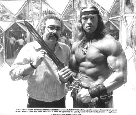
-
thespaceinvader
- Retired Art Director
- Posts: 8414
- Joined: August 25th, 2007, 10:12 am
- Location: Oxford, UK
- Contact:
...you wanna EXAGGERATE on conan? You're crazy, man, crazy...
But yeah, i was kinda thinking that the line could get heavily built as it went up in levels, since that's what the descriptions seem to do - the HI description says nothing about the build of the soldier, the shock trooper mentions that 'they're prodigiously well-built', and the Iron Mauler that 'they could match ogres in contests of strength.' The armour's more emphasised in the HI description, and the tactics.
It may just be me, though, but the sort of muscle that takes a modern gym, obsessive training for hours every day, 7 or 8 thousand calories a day and more often than not, steroids, looks HORRIBLE to me in a fantasy environment where those things just aren't really accessible. The dwarvish guardsman portrait looks way too beefy, i've always thought. PLus, that kind of muscle is just over-encumbering - it goes for size and look rather than usefulness - it's interesting to note that most of the contestants in strongman competitions are just BIG, they're not usually very well-defined. Clicky for images
Also, woulda been handy if you could have weighed in at the lines-and-flats stage, rather than waiting til the image is basically finished =) it's less work to make the appropriate edits that way...
http://thespaceinvader.co.uk | http://thespaceinvader.deviantart.com
Back to work. Current projects: Catching up on commits. Picking Meridia back up. Sprite animations, many and varied.
Back to work. Current projects: Catching up on commits. Picking Meridia back up. Sprite animations, many and varied.
-
krotop

- 2009 Map Contest Winner
- Posts: 433
- Joined: June 8th, 2006, 3:05 pm
- Location: Bordeaux, France
Just my 2 cents, but I think that's Jetryl's point as far as I understood. The heavy infantryman should be more like these big guys from strongman contests, while yours is more like an athlete. But I read somewhere you suggested to move the head closer to the shoulder/torso, or well just a bit down, sounds like a good idea if you want to make him heavyset : guys with no neck always look tough in cartoons.
Don't trust me, I'm just average player.
***
Game feedback for the Nightmares of Meloen
Art feedback by mystic x the unknown
***
Game feedback for the Nightmares of Meloen
Art feedback by mystic x the unknown
-
thespaceinvader
- Retired Art Director
- Posts: 8414
- Joined: August 25th, 2007, 10:12 am
- Location: Oxford, UK
- Contact:
That's a good point about the neck, and easy enough to do. Thickening and enlarging the hand and forearm that we can see would also be easy enough. But honestly, i'm not certain how to approach particularly thickening the chest, but enlarging the trapezius, as well.
Also, WRT realism etc, clearly this sort of equipment can be used by average-size people. The model wearing this armour in the stock i used isn't exactly Ah-nold, and she seems to be able to use it reasonably well...
Also, WRT realism etc, clearly this sort of equipment can be used by average-size people. The model wearing this armour in the stock i used isn't exactly Ah-nold, and she seems to be able to use it reasonably well...
http://thespaceinvader.co.uk | http://thespaceinvader.deviantart.com
Back to work. Current projects: Catching up on commits. Picking Meridia back up. Sprite animations, many and varied.
Back to work. Current projects: Catching up on commits. Picking Meridia back up. Sprite animations, many and varied.